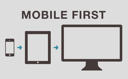
Not long ago, developers were designing apps and websites for desktop, treating mobile development as an afterthought. Nowadays, many organizations are designing for mobile first and later on making design adjustments for other delivery platforms. This is the core of the mobile first paradigm.
Why choose the Mobile First Approach and what is the benefit?
Figures speak for themselves: 60% of American cell phone users own at least one smart device and almost 40% perform nearly all their web browsing on a smartphone. Companies want to ensure that this ever growing number of customers can access online content easily.
Instead of taking a a browser application and removing many attractive and compelling features in order to create a mobile version, developers treat the mobile experience with increased attention. Having a properly designed mobile website, enhancements can be added for devices with larger screens and more resources.
Along with the technical positives, from a design perspective, a mobile first approach helps us develop for ease of usability.
What if the Web Design is not Mobile First?
A browser-based design is very likely to require a certain amount of degradation of the features in order to fit the limitations of a small touch screen. Performance issues may also rise when dealing with graphic-heavy sites because the mobile user has a device which is not only smaller but is also frequently on a lower connection speed.
How can you spot Mobile First?
A design that uses mobile first is feature-rich and elegantly streamlined. It has intuitive navigation and low latency to create a seamless user experience compared to mobile designs that were created using a browser-based design as a starting point which tend to be slower, sometimes unresponsive and may have navigation issues or missing features.


