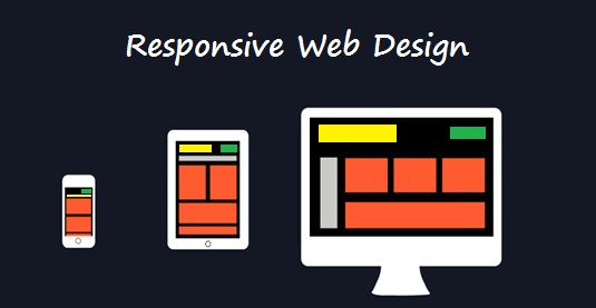
We talked about what Responsive Web Design is, now let’s see how to approach it.
Step 1: Fluid grids.
One key idea behind the scenes of responsive design is using the fluid grid. The old design layouts were mostly based on rigid pixels. Fluid grid is about using proportions. So, when either the layout is minimized on mobile device screen or stretched on a big monitor, all of the elements in the layout will resize their widths in relation to one another. There isn’t a big difference between working in percent or in pixels and you don’t need to learn other properties or CSS selectors. Working in percent might even be more simple, because it’s rather clear what width: 100% means. No matter what the size of the screen is, the mentioned div will always be at a maximum width. If instead of percent you would have had pixels, then regardless of how the big the screen would be, the div will always be at 100 pixels.
When designing in a responsive way, there are a few elements that should not be used. Textured borders in your columns or horizontal gradients are such examples. They won’t fit anymore, mainly because they won’t scale well horizontally. There is something you can use – textures easy to tile, such as grain, grunge and so on.
When you scale the design down horizontally to fit smaller screens, you will come to a point when some text will simply be too big to fit in anymore. This is the point when you should decide which text on the page should stay the same size at any screen width, and which text should be adjusted. The right way to do it is – x should always be 1.5 times as big as y, namely how small or big the text is compared with the other text on the page. Do not use constant values like – x should always be 25pt bigger than y.
Essential aspects to keep in mind when creating a fluid grid:
- Regardless of the screen size, the key information has to remain visible
- The text must be easy to read, despite of the amount of columns
- Keep all the elements easy to find and the navigation easy and organized.


