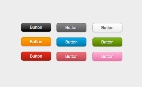
An interesting experiment was conducted on how certain colors would influence the click rate of a button. Green, yellow and red were used and obviously the red button won. But the real reason why the red color won was not the color itself but the color palette of the website. In other words, the reason was contrast.
Contrast was the hidden factor that played the most important role in the test because of the light color background making the red button stand out. The higher the contrast is, the more an element will stand out. This technique is used both in art and design to catch attention and lead the eye to a certain spot, to make a specific element more visible but also to hide something. Contrast is also used by magicians to distract people while performing a trick. Another example of contrast use are traffic lights. Three colors on neutral background. The box is often black or grey so it won’t divert the attention from the colors – red, yellow and green.
If you want to run a similar test, take some examples of buttons with various colors. You can put them on single website or create a landing page for each one. Putting all the buttons on one page will have higher value because people will have to decide between presented examples without being distracted by switching between pages. Time limit can also be included to force people to speed up their decision process and make them behave more instinctively.
Summary
Color is not a very important factor compared to contrast. One of the factors that will impact the number of clicks is that the buttons stand out. If your website has a dark background you should use lighter colors for buttons and vice versa.
See also: Effective Marketing using Color Psychology


