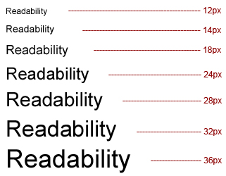
Typography is the art of arranging space between letters, space between words, space between the lines and the length of a line in order to enhance the visibility of the language and make it more readable. Good typography makes your website cross compatible and legible to read and consists of these factors: responsiveness, spacing, contrast and readability.
Responsiveness
Typography should be responsive enough so it may be adjusted for different display widths and lengths. Display units such as ems or pixels should be used wisely to create a responsive grid layout.
Spacing
When designing a website for small screens, it is important to keep as much space as possible between letters even if it requires more scrolling horizontally or vertically. Add margins so that the user will know where a screen text begins and ends. Around 20% space should be used between lines. Instead of using 16 as the space size between lines written with font size 12, use 14 as the line space between lines using font size 12.
Users will prefer scrolling over congestion of words. Apply the same logic to website elements and components, navigation bars, tabs, menus, etc. Keep in mind that mobile browsing supports the vertical format rather than the desktop horizontal one – text, images and others should be aligned accordingly.
Contrast
Contrast is the use of different colors integrated with each other in order to help users read your content with ease. It is always best to start with black text/white background or white text/black background combination. You can thus experiment with different colors by keeping black and white as the fixed ones throughout.
Readability
The statement “95% of the information on the web is a written language” shows the readability importance. It is advisable to use Sans Serif or Helvetica fonts which are soothing to the eyes. If too many characters are present, then font size should be kept adequately small. Even lines with a few characters can become cumbersome for a user to read everything. In this case, large fonts should be used accordingly. Fonts with narrow or wide strokes should not be used. Normal appearing fonts should be used rather than condensed or skinny fonts.


