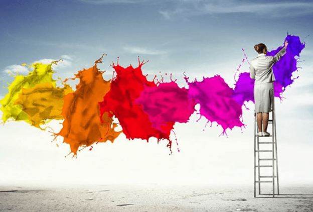
Color psychology is a good way to catch the eye of viewers, but too much color will be distract your users. If you can, stick to 2 to 4 colors only. Colors exist everywhere, and while perceptions of color are somewhat subjective, there are some color effects that have universal meaning.
Red
Represents: Ambition, vitality, passion, strength, anger
Mobile use: Use to highlight important items that have to be seen.
Pink
Represents: Emotionally soothing and calming, femininity, softness, health, innocence; alleviates feelings of irritation, loneliness
Mobile use: Apps that need to be gentle or relaxing (Health apps that might hold stressful information)
Orange
Represents: Joy, fun, value, discounts; stimulates mind to find interests, increases food craving
Mobile use: Great for food-related apps (recipes, shopping lists etc) and mCommerce apps
Yellow
Represents: Wisdom, joy, happiness, creativity, intelligence; encourages optimism and self-confidence; fatiguing to the eye
Mobile use: Apps that require creative thought (drawing apps or note-taking apps)
Green
Represents: Relaxation, balance, self-respect, well-being, learning, growth
Mobile use: Safe colour to use if you can’t decide on a theme. Also suitable for apps that promote learning (trivia apps).
Blue
Represents: Calm and relaxation, night, protection, creativity, clarity, trust, memory, suppresses appetite
Mobile use: Apps that need to promote feelings of calm and relaxation, it may be used in conjunction with pink (Health apps, weight loss apps); use also for apps requiring user trust (mCommerce apps)
Brown
Represents: Honesty, dependability, stability, comfort; alleviates insecurities
Mobile use: mCommerce apps and apps selling a service
Black
Represents: Comfort, protection, silence, mystery, authority, luxury, power
Mobile use: Apps with a more serious tone and also to indicate luxury.
White
Represents: Peace, comfort, purity, truthfulness, lightness
Mobile use: Complicated mobile apps to make it appear less cluttered.


