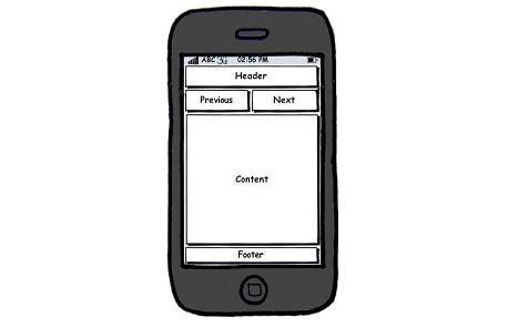
There are certain aspects & techniques that a web developer and web designer has to follow in order to have a clean & professional looking mobile version of a website. Mobile development can be difficult, but inspiration is also a huge factor.
LAYOUT
Logo
The logo is one of the main elements in the layout. You want to make it attractive but keep in mind the size shouldn’t exceed 2 KBs.
Navigation
First of all you need to have the links to the main pages on your website on this bar and it should always be at the top. Creating a thorough navigation for your website is an essential aspect to make your website mobile friendly.
Content
– People using mobile devices are on the go, so they don’t have plenty of time to view the content. You should cut down your content to major value points in the same time providing the user with a link to the main article.
– Make sure that you don’t have too much graphics because most mobile phones take a large amount of time to display images. Try and use images and graphics only where contextually needed. They should light-weight files like .jpeg or .png format. Always size your images properly to avoid the visitor zooming an image to see it right. Always use the ALT text property for the images.
Footer
Keep it clean and free of unnecessary hyper-links.
CODING
Valid Code
Write proper code and check it to make sure it’s 100% valid because some mobile browsers don’t behave so good as their PC correspondent.
Fluid Layouts
Because of the huge number of mobile devices in use, setting and checking the layouts on all of them is impossible. One way to address this problem is to use fluid grids to adjust to the screen size. Instead of setting widths in pixels, use percentages.
Browser Detection
You should include an automatic “Mobile Browser Detection & Redirection” server-side script (eg. PHP) or an “User Agent detection” where the server’s decision is based on how the incoming browser describes it’s capabilities.
Don’t go heavy on the ads
CPM is high on mobile devices so you may think that filling up your mobile page with ads is a good way to get some cash. Totally wrong. Ignoring the user-experience may cause your website to be avoided by everybody.


